BrightHouse developed the brand identity for Leadership Atlanta’s inaugural Women’s Summit in January of 2018. Here’s how we helped design the visual landscape of their first Women’s Summit to ensure that it communicated their purpose and aligned with their established organizational identity.
For forty-eight years, Leadership Atlanta has been building community by inspiring leadership through committed service. With a large and distinguished alumni network, Leadership Atlanta connects, develops, and inspires local leaders to go out and build Atlanta’s metro communities.
BrightHouse’s own CEO, Ashley Grice, is a graduate of the Leadership Atlanta program. She connected us with the opportunity to develop the brand identity for their inaugural Women’s Summit in January of 2018. The question required a unique creative solution. How to launch this first Summit with a new brand that communicates their purpose and aligns with their established organizational identity? The conference theme; POWER – how to take it, own it, and share it, inspired a range of logos, branding, print and digitally animated invitations, and extension ideas for this foundational event.
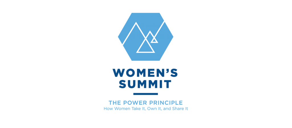
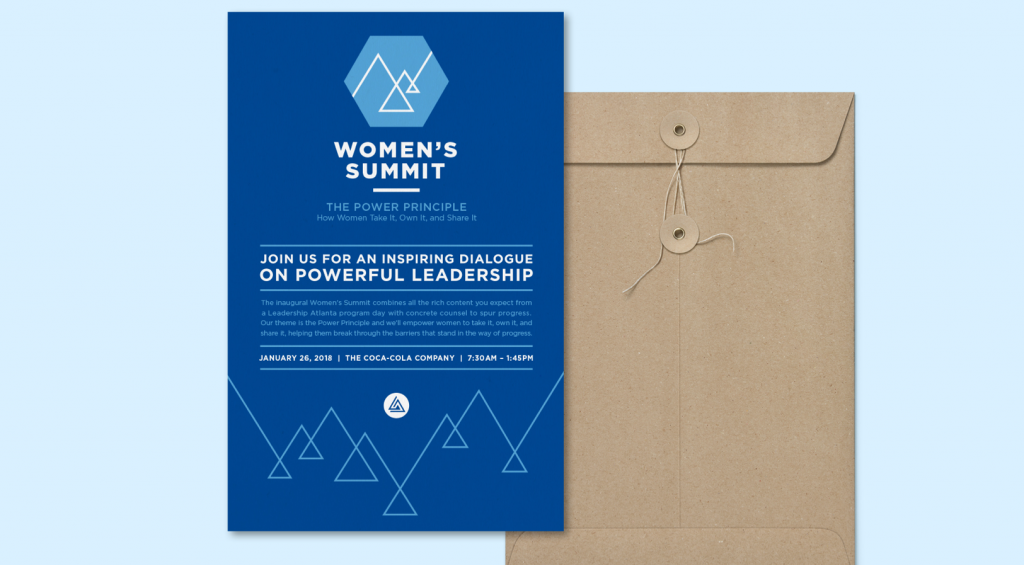
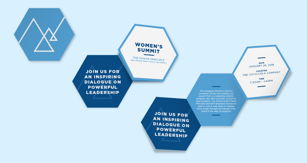
Our first concept, Reaching the Summit, builds around the idea of an empowering the journey. Deconstructed, weaving triangles make up the abstract mountain forms and tie the logo back to the Leadership Atlanta logo. The upward angles give the mark positivity and express movement and social change. Within the negative space of the linear mountainscape, a “W” can be seen making this icon unique to the Women’s Summit. The added depth with the large mountain in the front and the small mountain in the back, draws the eye through the logo on a journey, reminding us that we are on the road to progress.
Beyond the graphical solution, Reaching the Summit, had two extension ideas, encouraging continued momentum beyond the conference. Extension concept one was a partnership with REI to bring an exploration theme to the summit with mountainous exploration gear and a female mountain or rock climber to speak and give a demonstration. We recommended Lynn Hill who made the first free ascent of the Nose on El Capitan in Yosemite Valley. A secondary extension idea was to host a follow-up retreat after the summit where leaders could go on a ropes course and build leadership and teamwork skills.
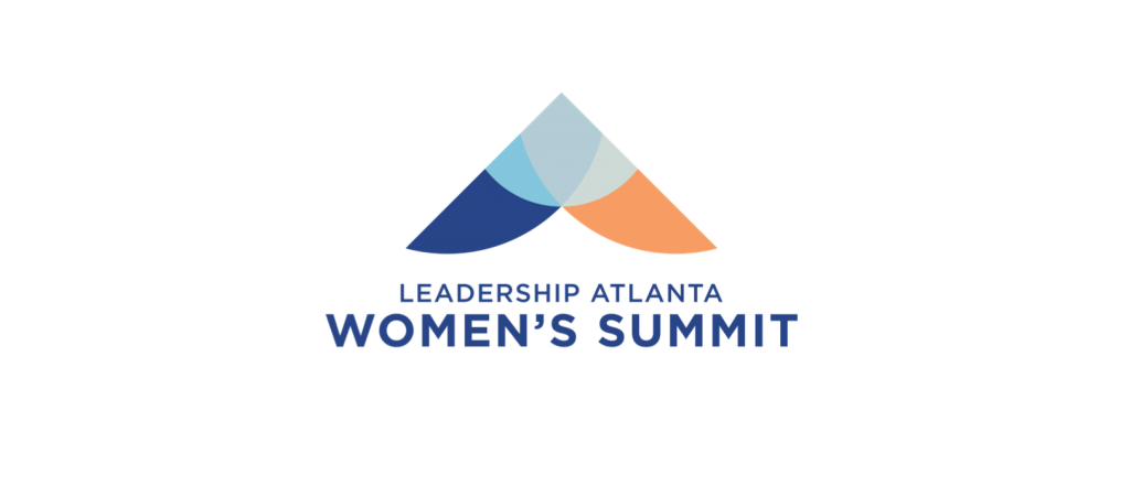
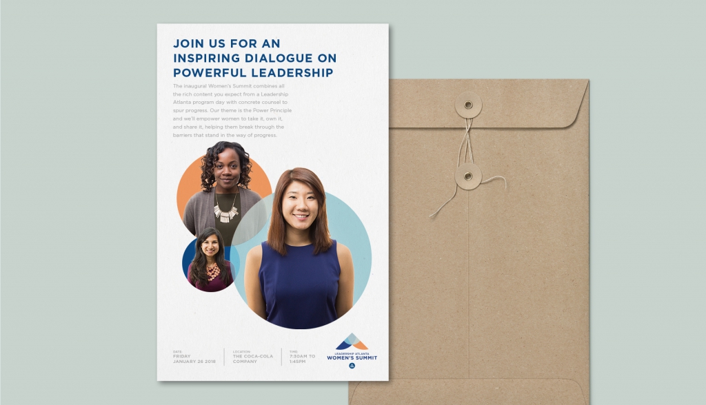
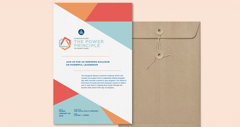
The second brand concept entitled, Moving Forward, focused on the overarching goal of the conference. The Women’s Summit was designed to enable women to become confident and more impactful in their personal, organizational and community spheres of influence so we represented the three spheres in this logo, overlapping them to form a powerful upward arrow. The upward movement of the logo physically shows how our summit will elevate women to the next level of leadership. It also relates closely to the current Leadership Atlanta triangle logo.
Selected experts from each sphere of influence – personal, organizational and community to speak at the next three conferences – or as a promotional video series leading up to the event. We recommended Dr. Pamela Stone, a sociologist from CUNY, who is an expert on women in the workplace to speak to the organizational sphere. Then, Leadership Atlanta could host an equal pay hack-a-thon leading up to the conference and share the findings at the summit.
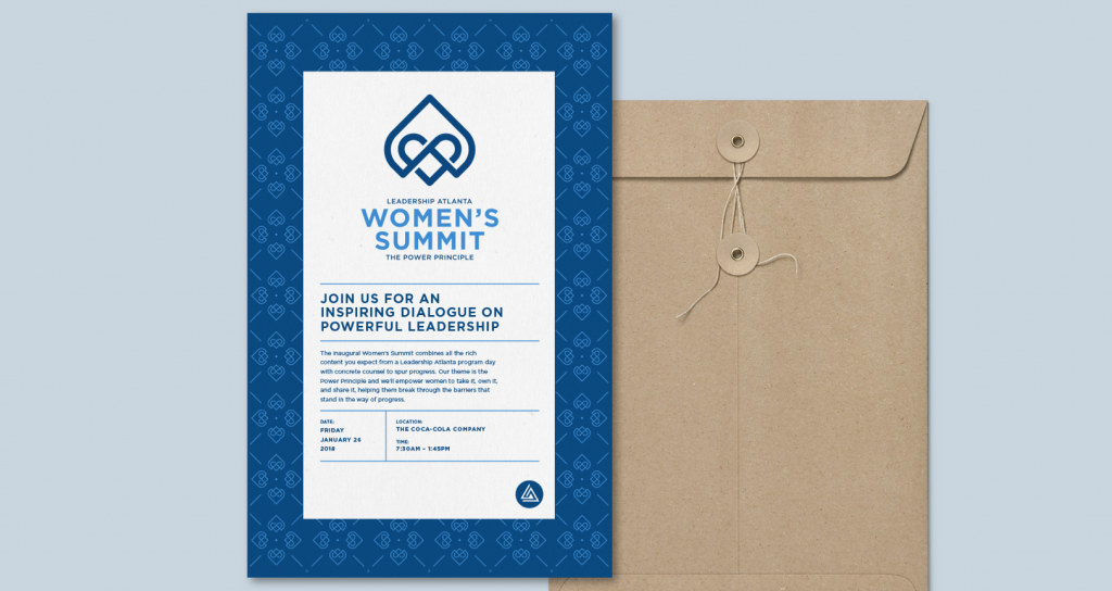
In the third design, Powerful Hearts the two p’s of the Power Principle — the theme of the conference — are clear in this logo, as is the W for the Women’s Summit. The heart is embedded in an upward arrow showing how care and support move us forward. The mark is a continuous line with no beginning or end, because the journey starts with self-care and moves to caring for others, which in turn feeds the self. This logo makes it clear that togetherness is what breaks the barriers on the road to progress, allowing us to advance.
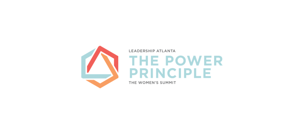
The last and ultimately chosen brand identity, Shaping Principles, unlocks the power within the Leadership Atlanta logo by deconstructing its elements and reconstructing them into a new geometric form. We see the three aspects of the power principal represented by their own color: take it, own it and share it. The red mountainous shape is take it and the red represents power. The orange shape wraps around the others and represents owning it. The most L shaped part is a version of your blue and represents share it. Each part of the power principle is interlinked, relying on each other for success.
The suggested brand extensions for the Shaping Principles concept built off the idea of being stronger when connected together. Creating a “Thank You Wall” at the conference where women can thank other women who have helped them break down barriers on their path to success. This idea would encourage summit participants to put pictures of their thank you note on social media with the hashtag #PowerfulTogether. Additionally, we suggested the Story Corps Bus stop by during the conference to capture powerful women’s stories that would be shared on the Leadership Atlanta website. An album would then be created with all of the stories to promote the next conference.
Our partnership with Leadership Atlanta was a unique opportunity to work with a foundational local organization. Empowering female leaders in our community is an initiative BrightHouse is proud to support. We hope the work we created inspired summit participants and helped launch this inaugural event, creating momentous change in the community.
And look for more information about our thought leadership here at BrightHouse on the blog. Be sure to follow us on Twitter and LinkedIn for the latest insights on purpose.